9 Region comparisons
The final tab in the app is dedicated to comparisons between regions. This is a simple interface, where the two regions to compare against each other are selected using the first two dropdown menus at the top of the page. The values to show in the table are controlled by the third dropdown menu - either as ranks, scores or the severity category.
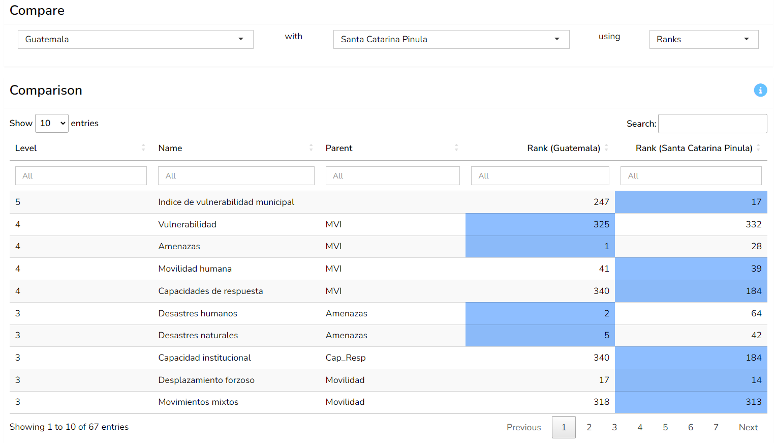
The table is similar to the “Details” table on the “Profiles” tab. It shows the values for each aggregate and indicator, from the index level downwards, and also shows the parent group. The score/rank/categorical columns are colour coded such that the unit with the highest value is highlighted. This is intended to show visually where one region is more “severe” than the other.
As with other tables, you can sort and filter the table by clicking on the headers and using the boxes, respectively.